When I started to work on the cover for SUN NIGHT about a year ago, I designed about 10 different versions. I knew that the collage would be the most important part of the design, and that the typeface used would lay over it. In the end, there were two versions that I really liked and shopped around, one with a traditional serif font and another with a script typeface. In my mind, it was important to me to express the serious themes of the story, reason for going with the serif font. I never felt completely sold in my heart on this version but I launched the book with this cover option to stay on schedule.
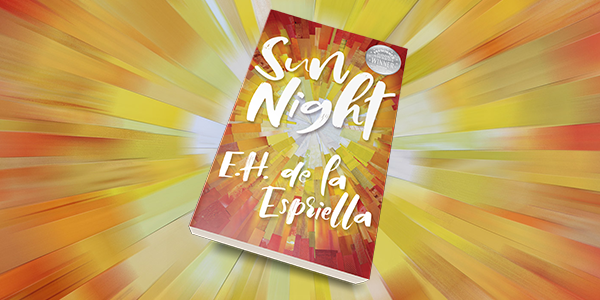
Now that the book has been released for six months and have been honored with the recent book award from the Florida Authors and Publishers Association, I felt it was time to explore new cover options, at least when it came to typography. I went back to the drawing board and started the long process of searching for typefaces and played around with different elements and effects. I narrowed it down to a hand drawn typeface that contains some childlike and playful features, and kept it in white so that it would stand out from the collage. Some minor effects have been added to help the typeface stand out, there is a light radial glow in yellow plus a drop shadow.
The book with the new cover is now available from Amazon on both Kindle or print version, as well as from the iBook store.
